
Recently a theme has emerged of artworks addressing communication modes and creating interventions in language. In The Pool Exhibition for Goldsmiths MFA, Jin Wook Moon has created a new language using a variety of everyday objects as symbols, like a variation on sign language. This was presented plastered across the exhibition space walls, in a newspaper and in a translated version of BBC News. Use of passports as symbols in this language particularly juxtaposes against the background news story about planes or an airport featured on the screen. This draws up issues of identity and highlights how important common understanding of language is to cohesion, whilst the development of a coded language enables secret transferral of information that may raise suspicion. He adds another level of critique in that the language is meaningless, questioning whether it is important that we read text where it is used within an artwork.
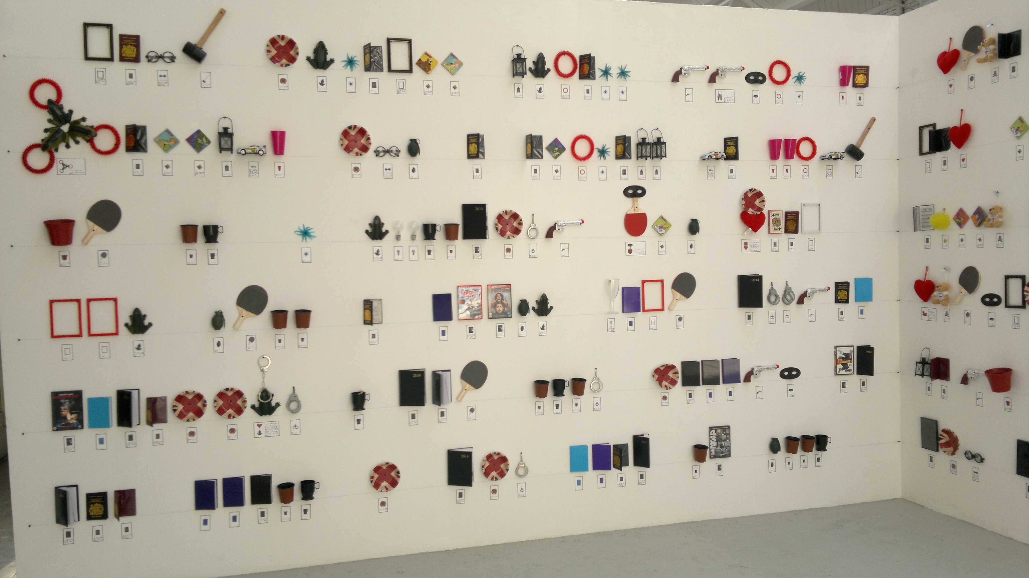
The Untitled Text by Jin Wook Moon
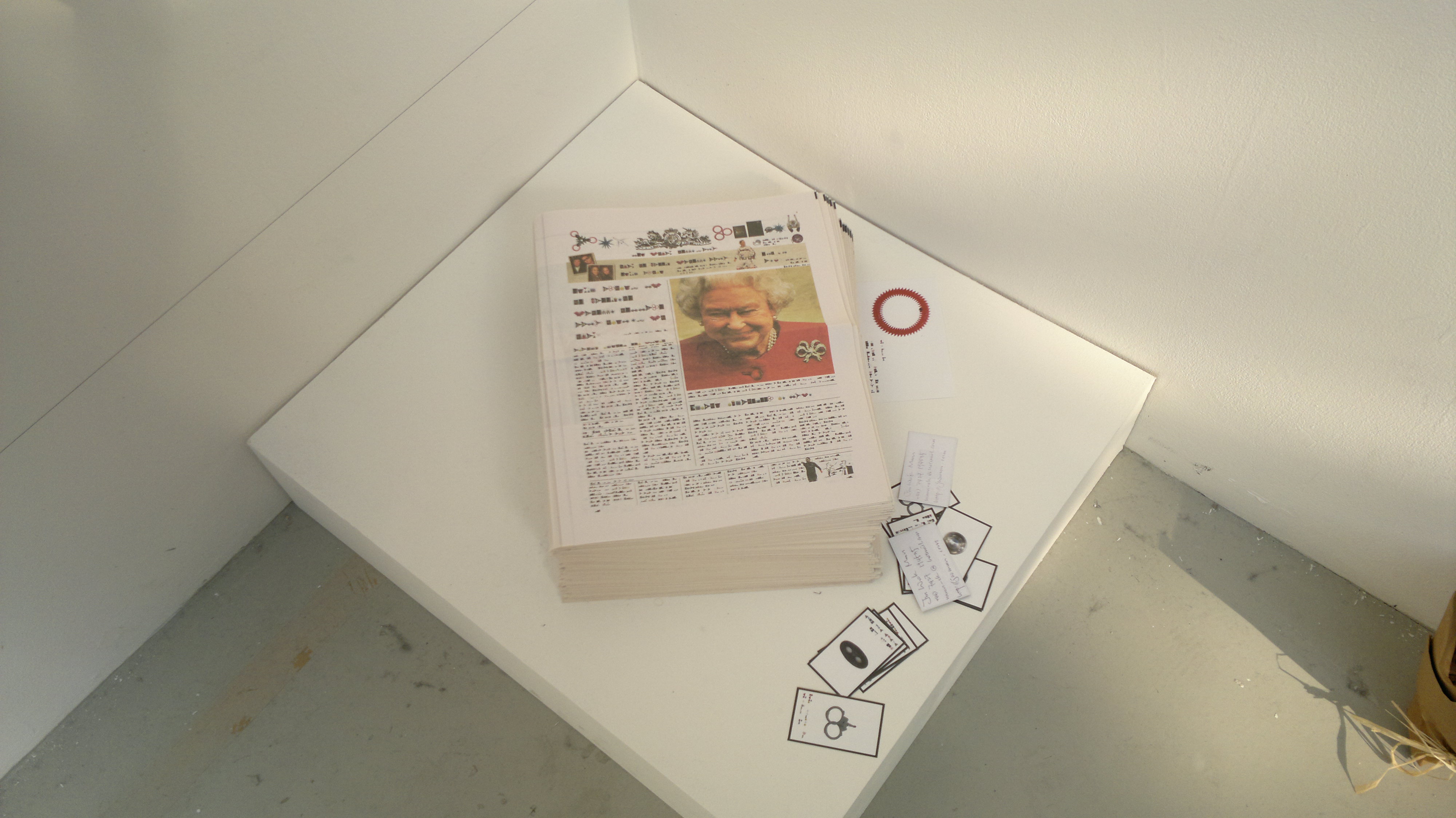
The Untitled Text by Jin Wook Moon
Meanwhile, included in the Visual Poetry exhibition at Maddox Arts is Glenda León’s Objeto Mágico Encontrado #3 (Magical Found Object #3), where the artist has applied flower petals in a variety of vibrant shades to the keystrokes of a typewriter, whilst in Objeto Mágico Encontrado #4 we see a text potentially produced with this, validating that Objeto Mágico Encontrado #3 produces a flowery dialogue that curator Gabriela Salgado suggests in the exhibition catalogue is symptomatic of a love letter.

Objeto Mágico Encontrado #3 by Glenda León
Plastique Fantastique have produced a series of posters in their post-apocalyptic installation, Your Extinction Our Future at IMT Gallery, with the vowels missing, consumed by the alien force of Neuropatheme, which can only exist by the conversion of humans into Phenome-Humans, much like the ‘upgrading’ of humans into Cybermen in Doctor Who. These question the permanence of humanity and language in an ever-changing world where mass (media) influences can have sweeping effects upon a population.

NFRMTN WNTS T B FR (2013) by Plastique Fantastique
This is similar to Georges Perec’s exploratory writing La disparition (1969) in which he works without the letter e, translated into English as A Void (1994) by Gilbert Adair, whilst the vowels are more directly absent in Plastique Fantastique’s work. The text in this example also refutes there being anything to communicate both in life and art generally.
Meanwhile, at Tate Modern a few works by Ellen Gallagher on exhibition including Greasy (2011) almost recapture some of these vowels. In these she has obliterated sheets of text from magazines with white paint except the letters e and o, rendering communication pointless or censoring information, whilst highlighting the frequency and shape of these letters. This brings potential sexual connotations to attention in both shape and sound, whilst this may apply more generally to all the vowels. In essence this might be viewed as sound art, a score to be performed like the instructions for a Fluxus Happening, whilst looking at León’s work may lead to imagining the noise it makes, a combination of harsh mechanical clunking and the delicate touch of the petals. Jin Wook Moon has already verbalised his language by reading the names of the objects in english, considerably lengthening text if we view each object as a single letter. Gallagher’s work also attracts comparison to Perec’s Les revenentes (1972), translated as The Exeter Text (1996) by Ian Monk, in which e is the only vowel used.
In relation to these works it seems relevant to discuss the use of the term character to describe the symbols of language. Each letter has its own story to tell within a greater narrative, as is particularly the case in Jin Wook Moon’s language. Each flower on Leon’s work has lived its own life and been lovingly preserved like the Egyptians embalmed their Pharaohs. Meanwhile Gallager’s characters are not individuals and could therefore represent different species or genders.
Visual Poetry: Intermedia Traditions in Latin America continues at Maddox Arts, 52 Brooks Mews, London W1K 4ED until 21st September.


 by Carlos Noronha Feio")
")


